Posts filed under ‘marketing’
Icons on E-Tourism sites
An icon design is one of the designer’s hardest challenges. Since icons help us execute commands, open programs or documents quickly, it should be immediately clear what kind of thing is represented in them. Normally, the best rule would be to keep them as simple as possible. I read a great article lately about mistakes in icon design, not so long after finding two examples of bad icon design on e-tourism sites:
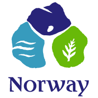
The first is a « map » icon, found on this wonderful Norwegian e-tourism site. It looks like this:  . What is it? come on, it’s the shape of Norway… everyone knows that. And if you didn’t, the site’s admin team added the word « map » just next to it – now you can’t go wrong. Well, let’s say that a good icon doesn’t need words to support it.
 . What is it? come on, it’s the shape of Norway… everyone knows that. And if you didn’t, the site’s admin team added the word « map » just next to it – now you can’t go wrong. Well, let’s say that a good icon doesn’t need words to support it.
The next is a « news » icon, found on the Visit Prague website. It looks like this:  . Is it a link to an image gallery? or maybe a stamp-like icon, taking us to The Czech Republic postal authority? again, the supporting text only proves how bad this icon is.
Found any interesting examples of icons on e-tourism sites? either good or bad, feel free to share them with us.

new comments